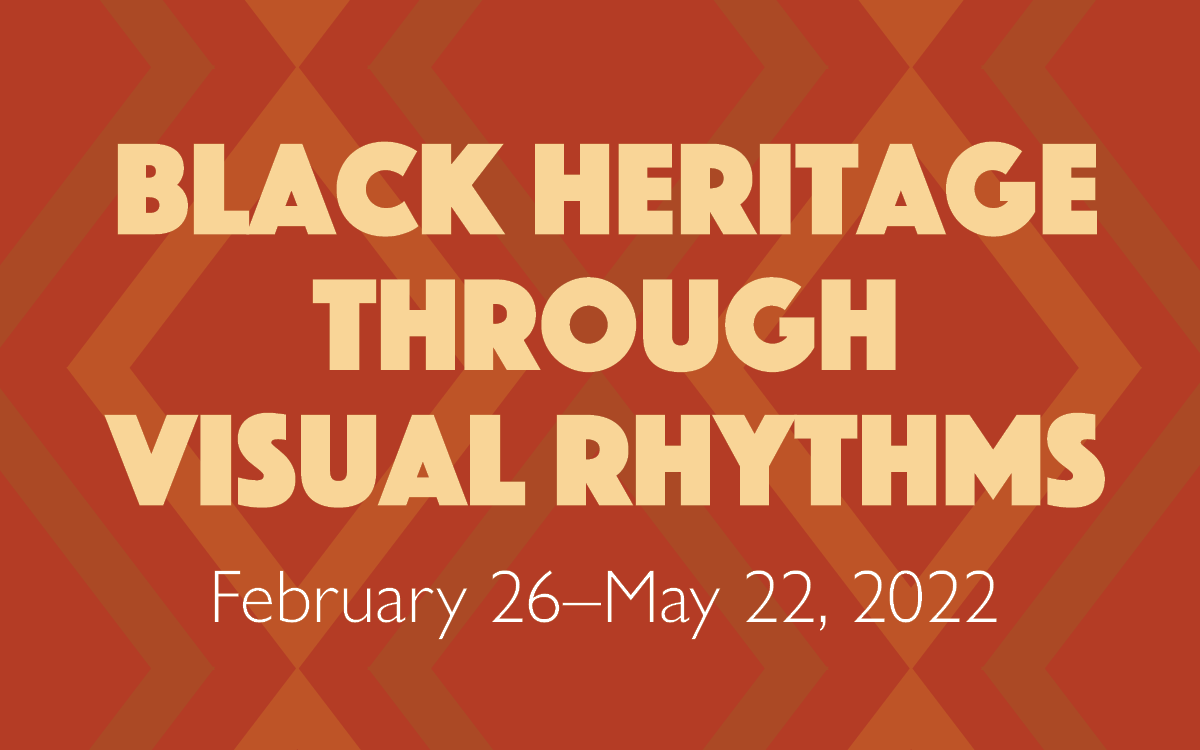
Black Heritage Through Visual Rhythms
EXHIBITION BRANDING & LOGO DESIGN
As the sole, internal designer for the Dayton Art Institute, I had the opportunity to create the logo and branding for the exhibitions that were curated in-house.
THE PROCESS
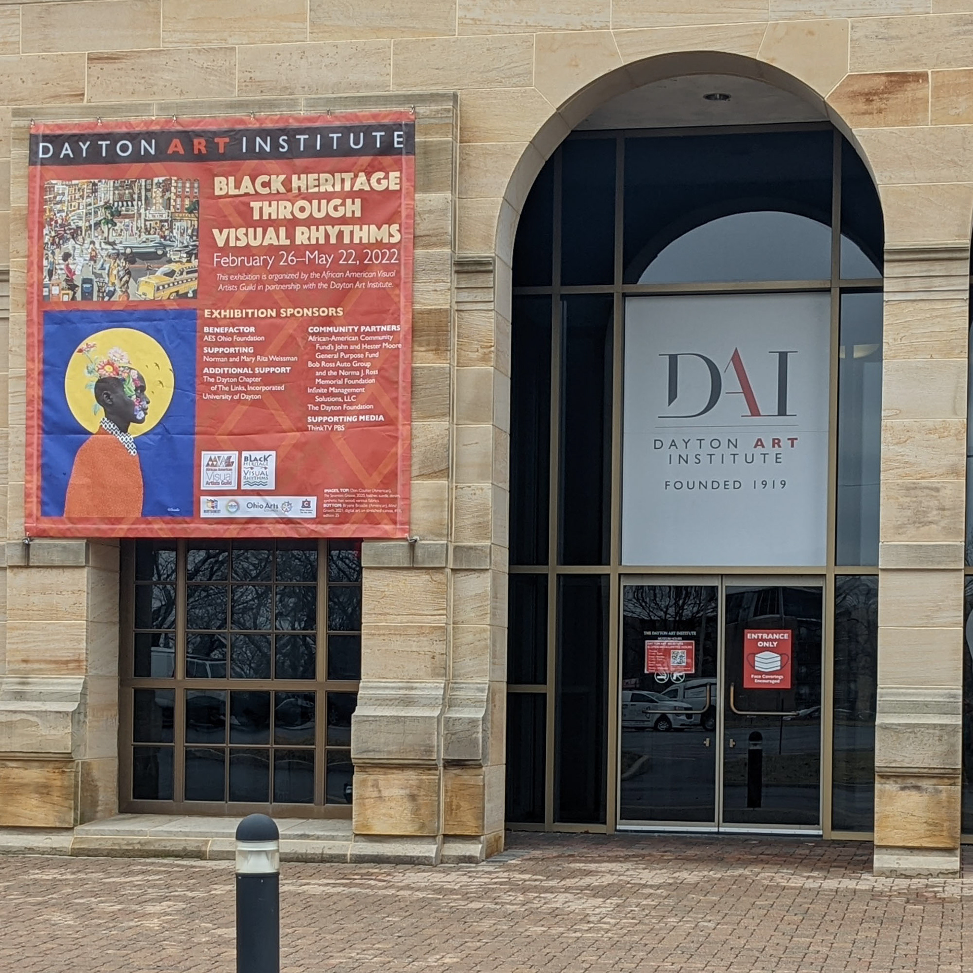
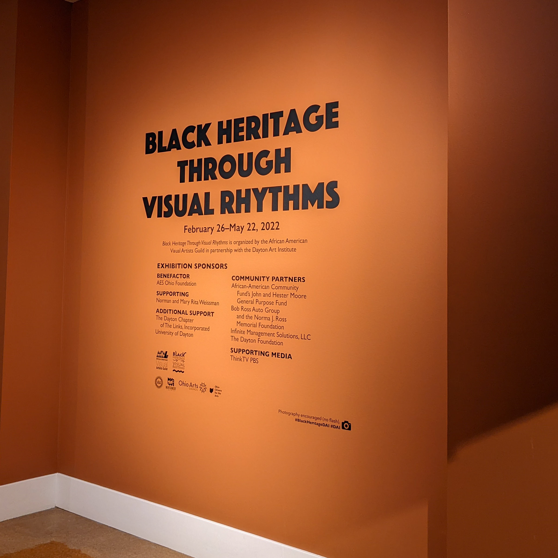
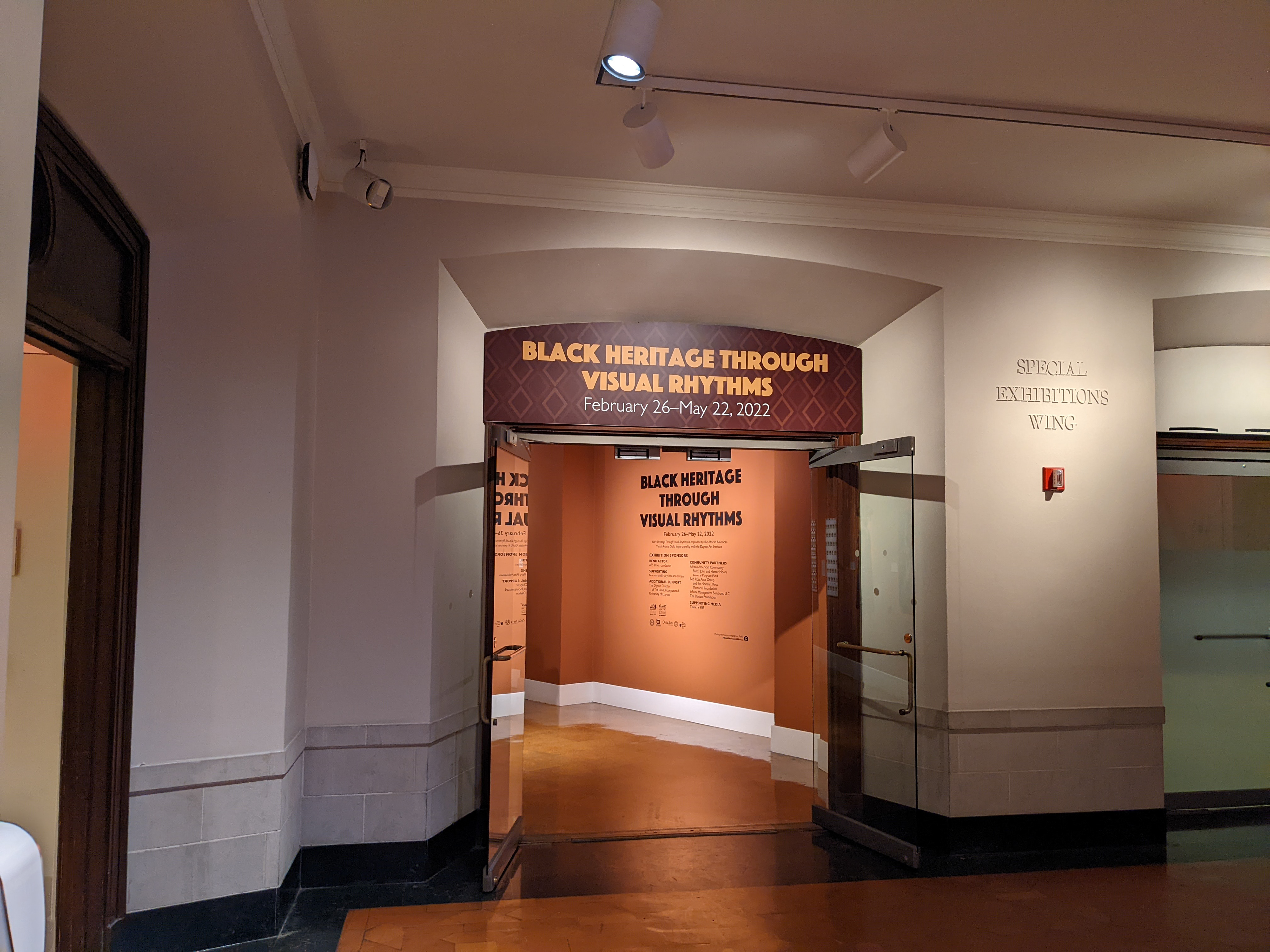
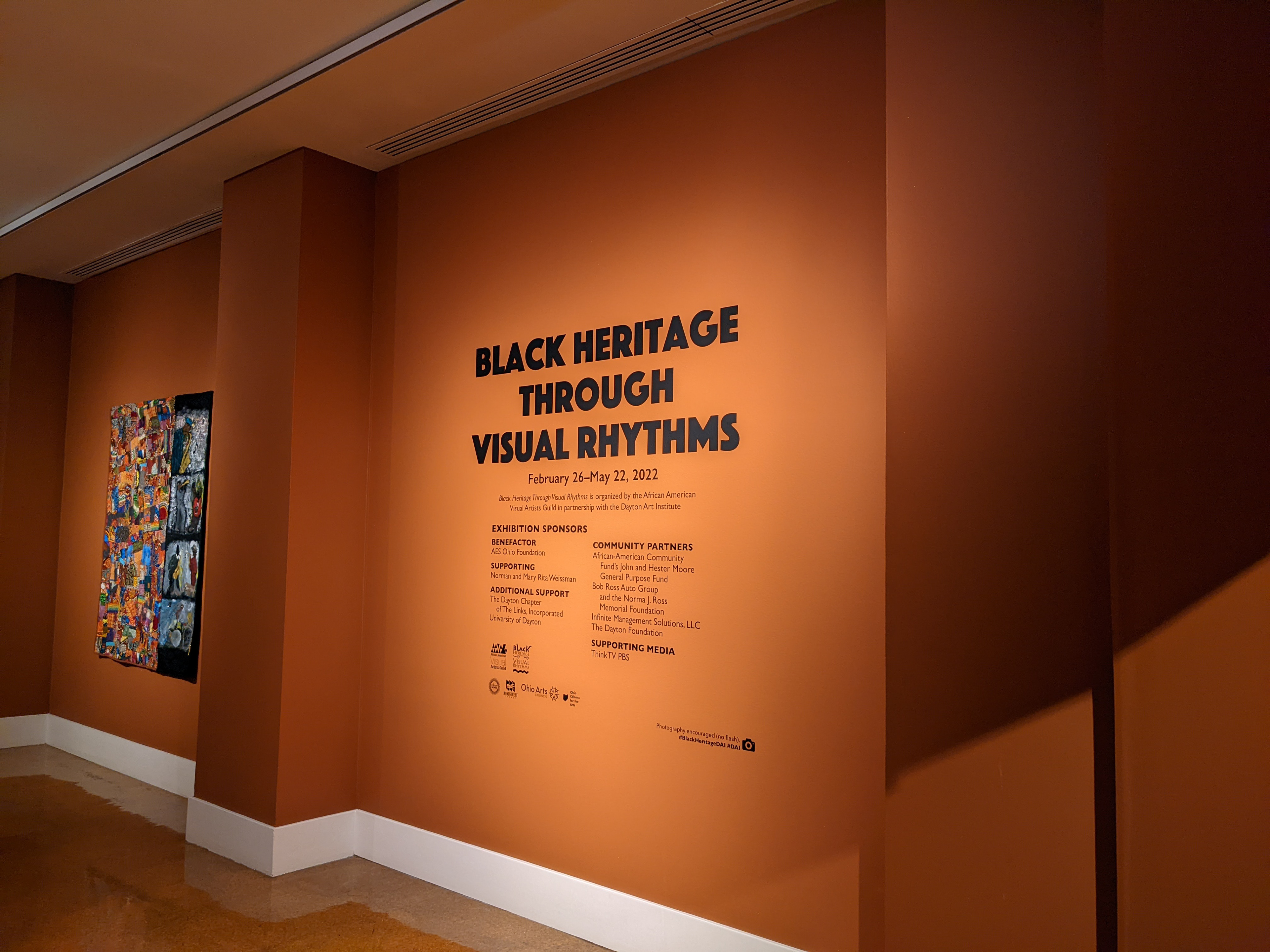
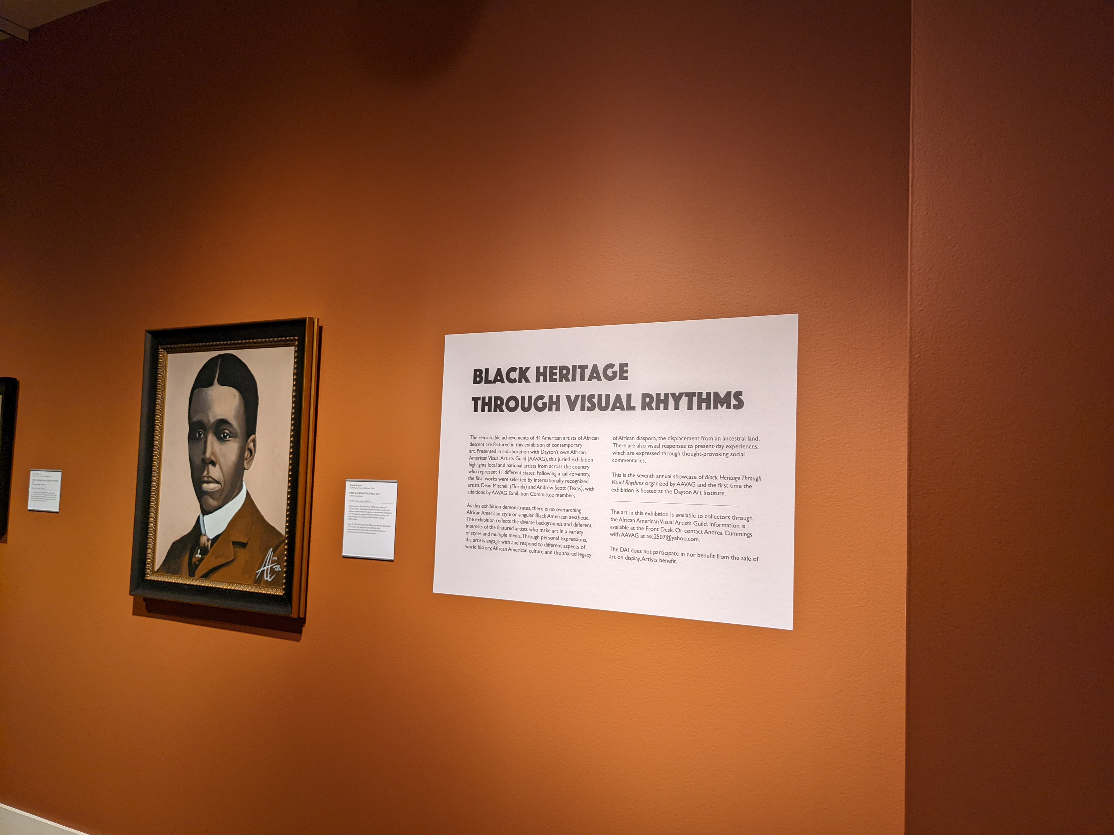
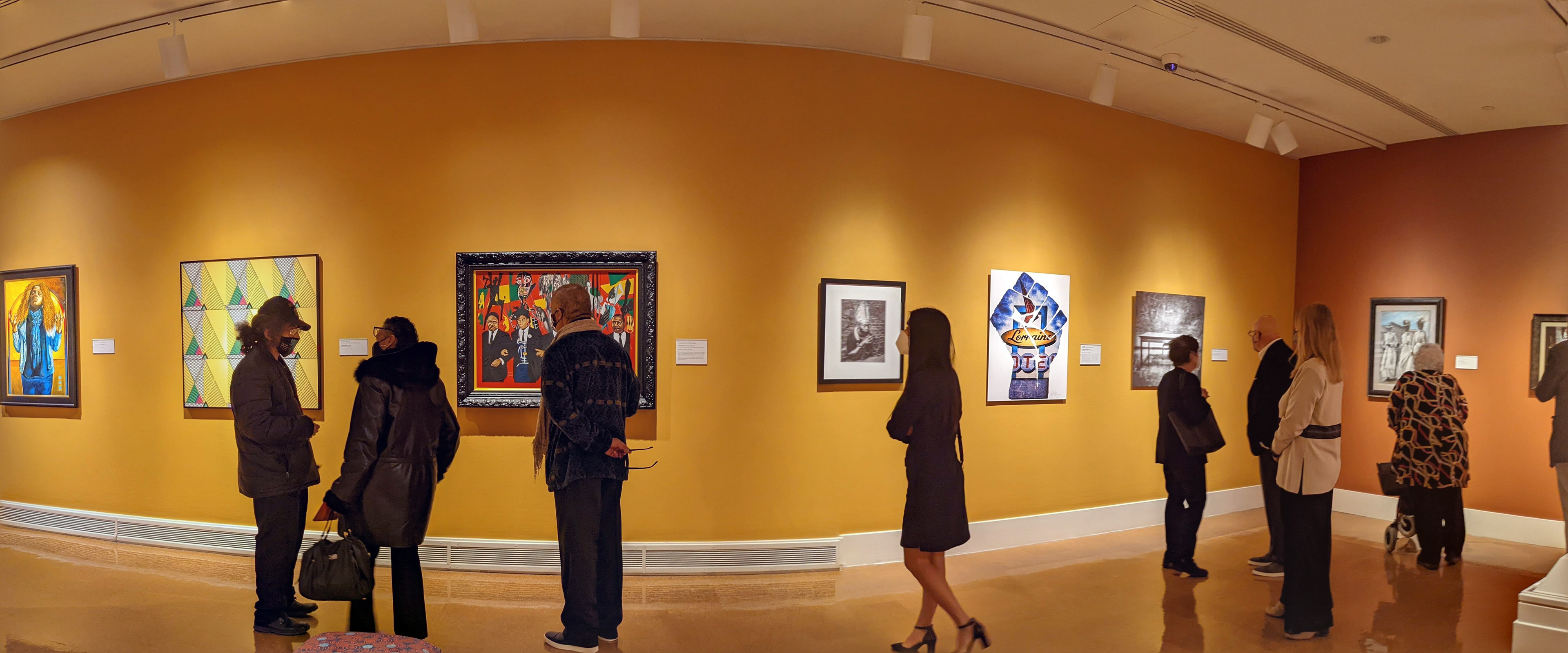
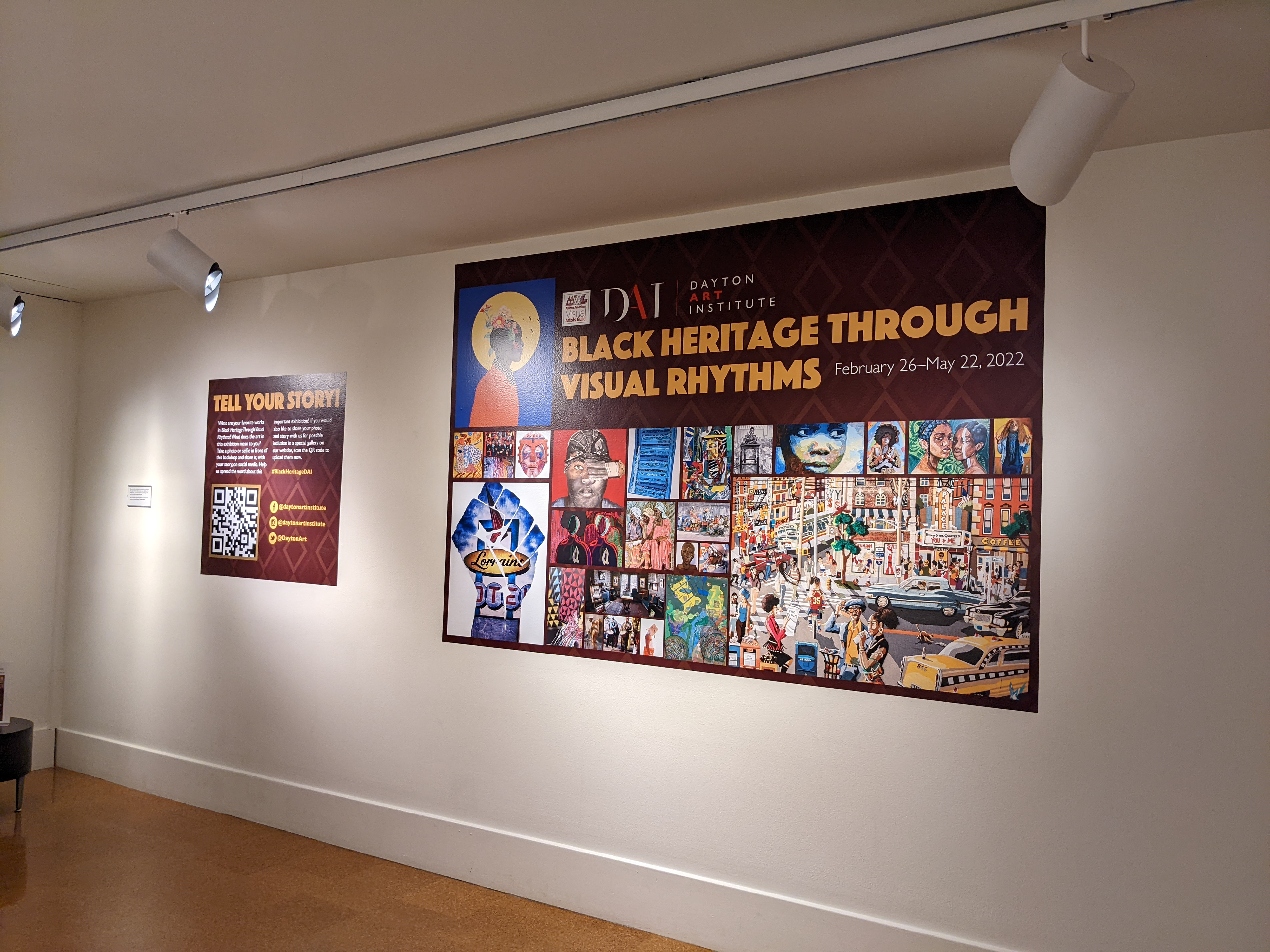
I sat down with the curatorial team to discuss the scope of the exhibition, what impact they hoped it would have in the community and any other background information that may help as I worked on the branding. Black Heritage Through Visual Rhythms was a juried show organized in partnership with the African American Visual Artists Guild. It would highlight the work of regional and national artists, many of whom had never been shown before.
With this in mind, I wanted to be very respectful with my approach to branding the exhibition. I looked at old book covers from Harlem
Renaissance authors, taking special note of the fonts and colors. I also reflected on the work of Mickalene Thomas, a prominent Black artist and photographer. I took inspiration from the deep colors in Thomas’ photographs, going with rich browns, golds and oranges. The font was reminiscent of the Art Deco fonts I observed on the book covers of writers like Langston Hughes.
Renaissance authors, taking special note of the fonts and colors. I also reflected on the work of Mickalene Thomas, a prominent Black artist and photographer. I took inspiration from the deep colors in Thomas’ photographs, going with rich browns, golds and oranges. The font was reminiscent of the Art Deco fonts I observed on the book covers of writers like Langston Hughes.
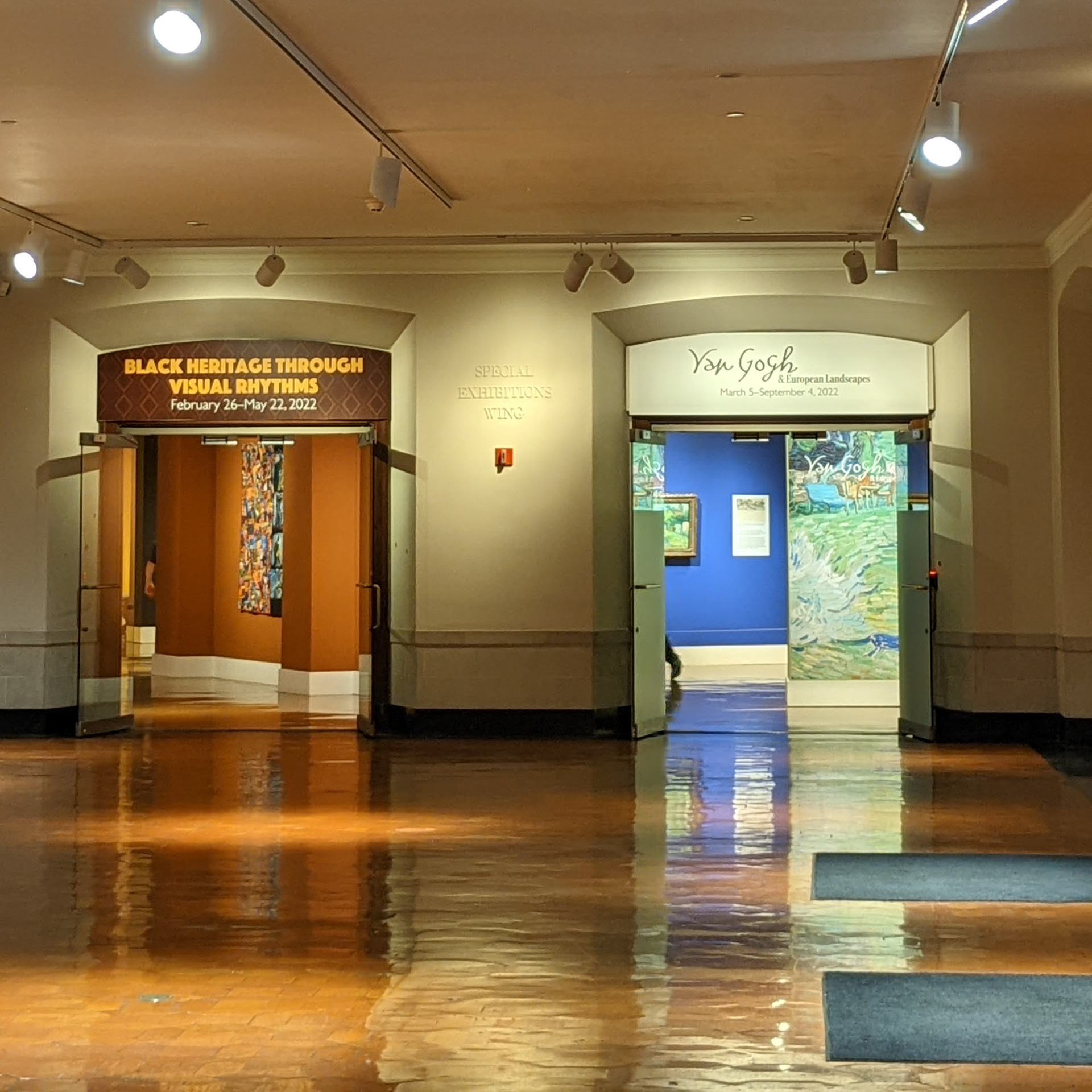
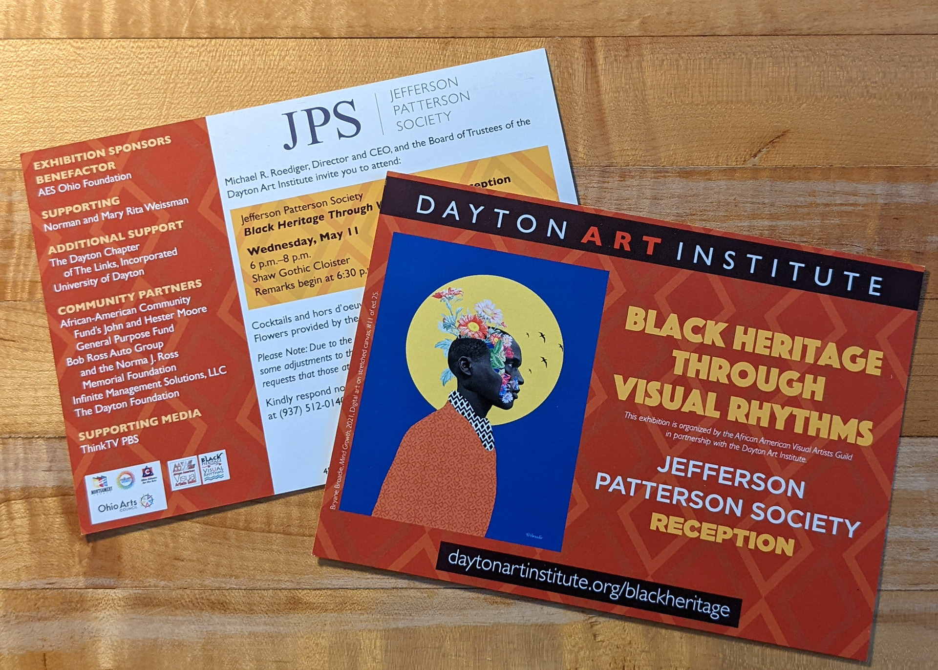
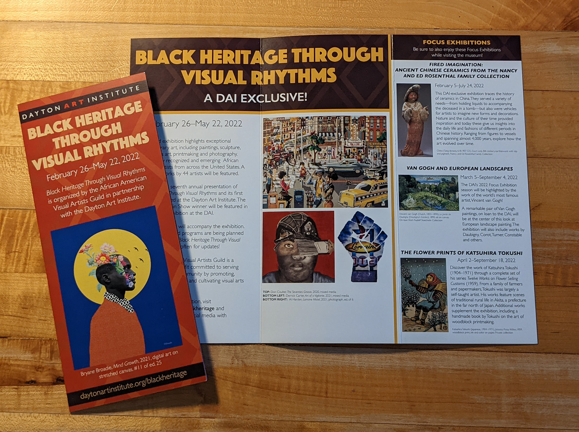
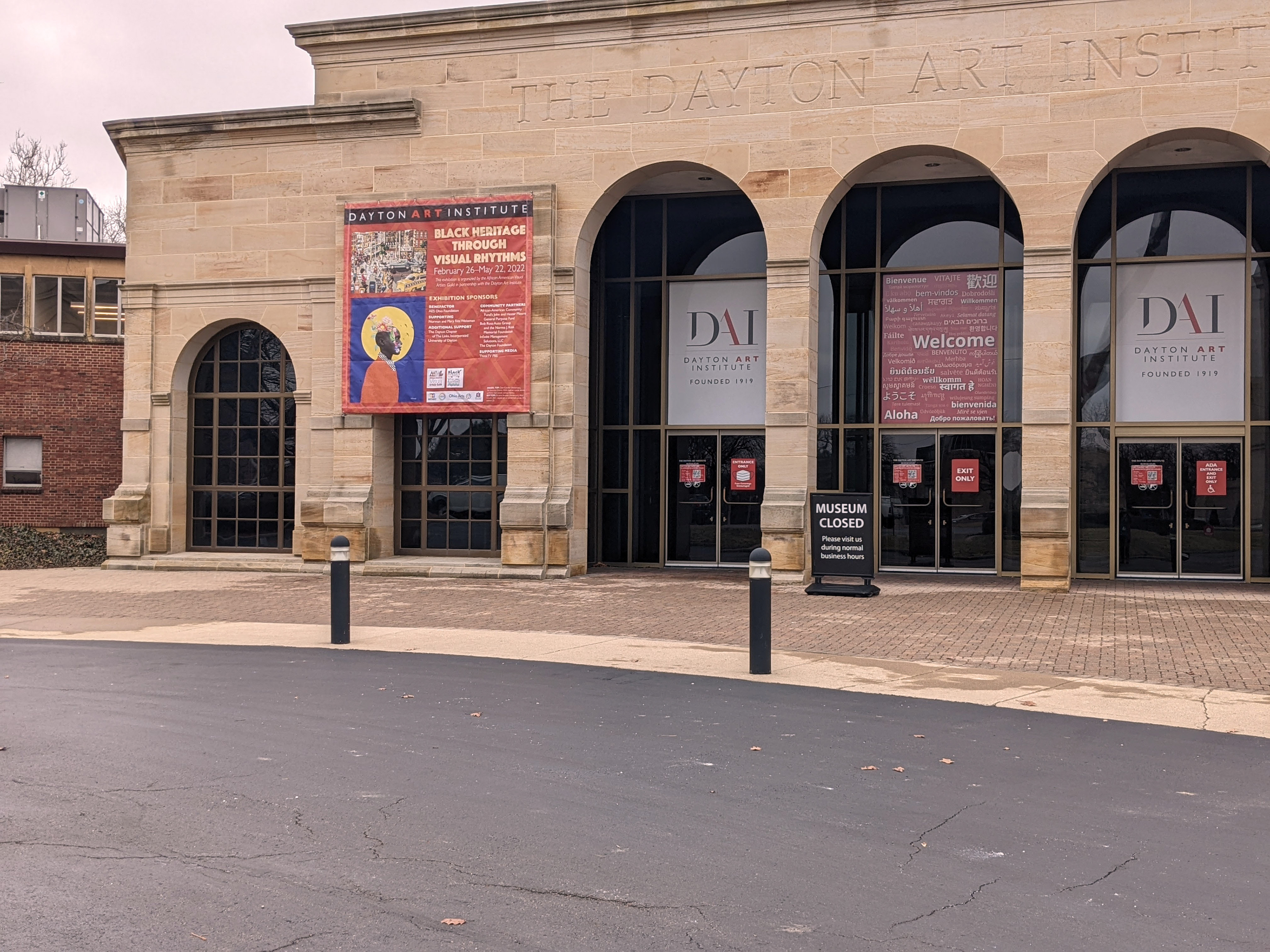
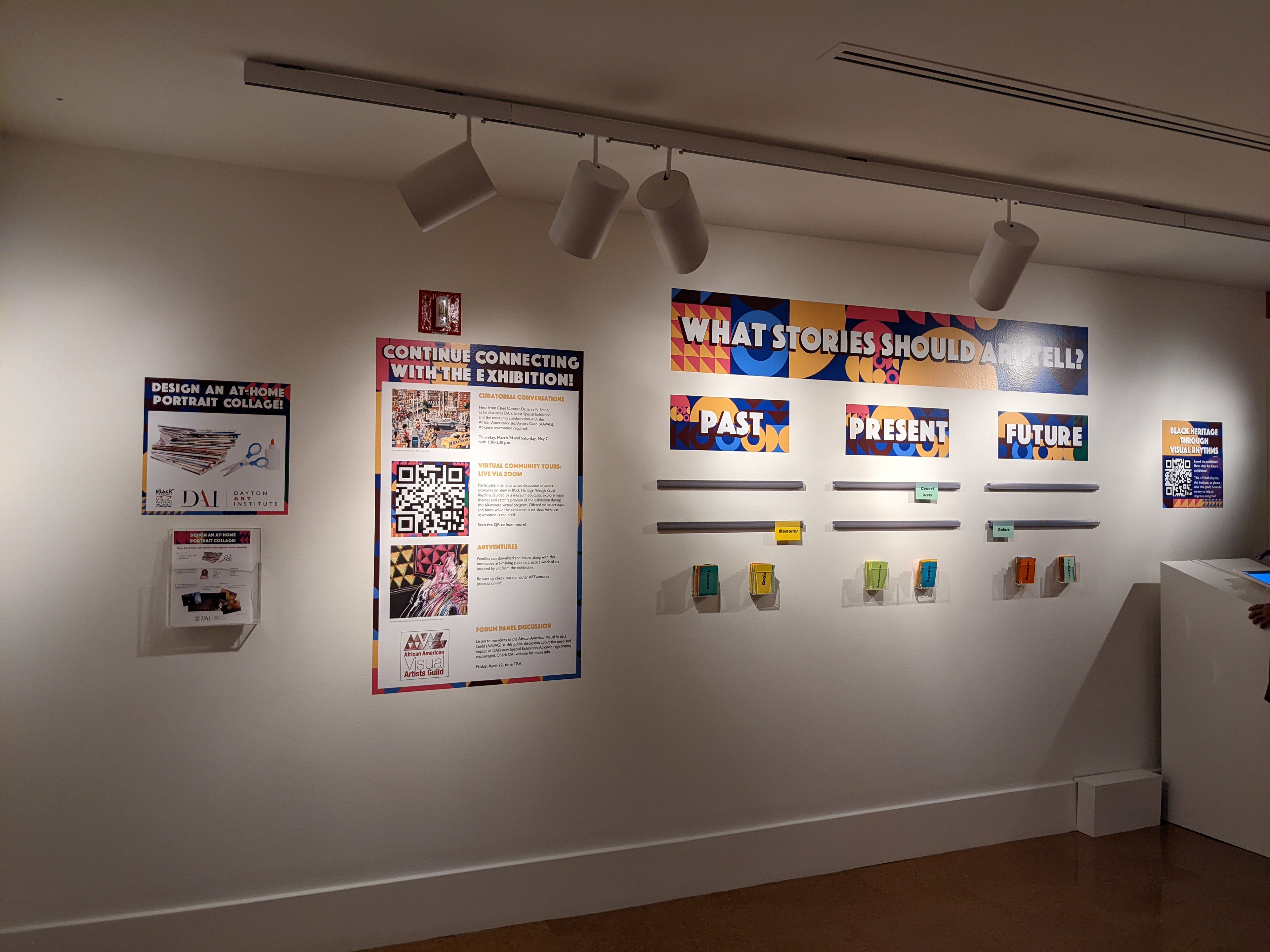
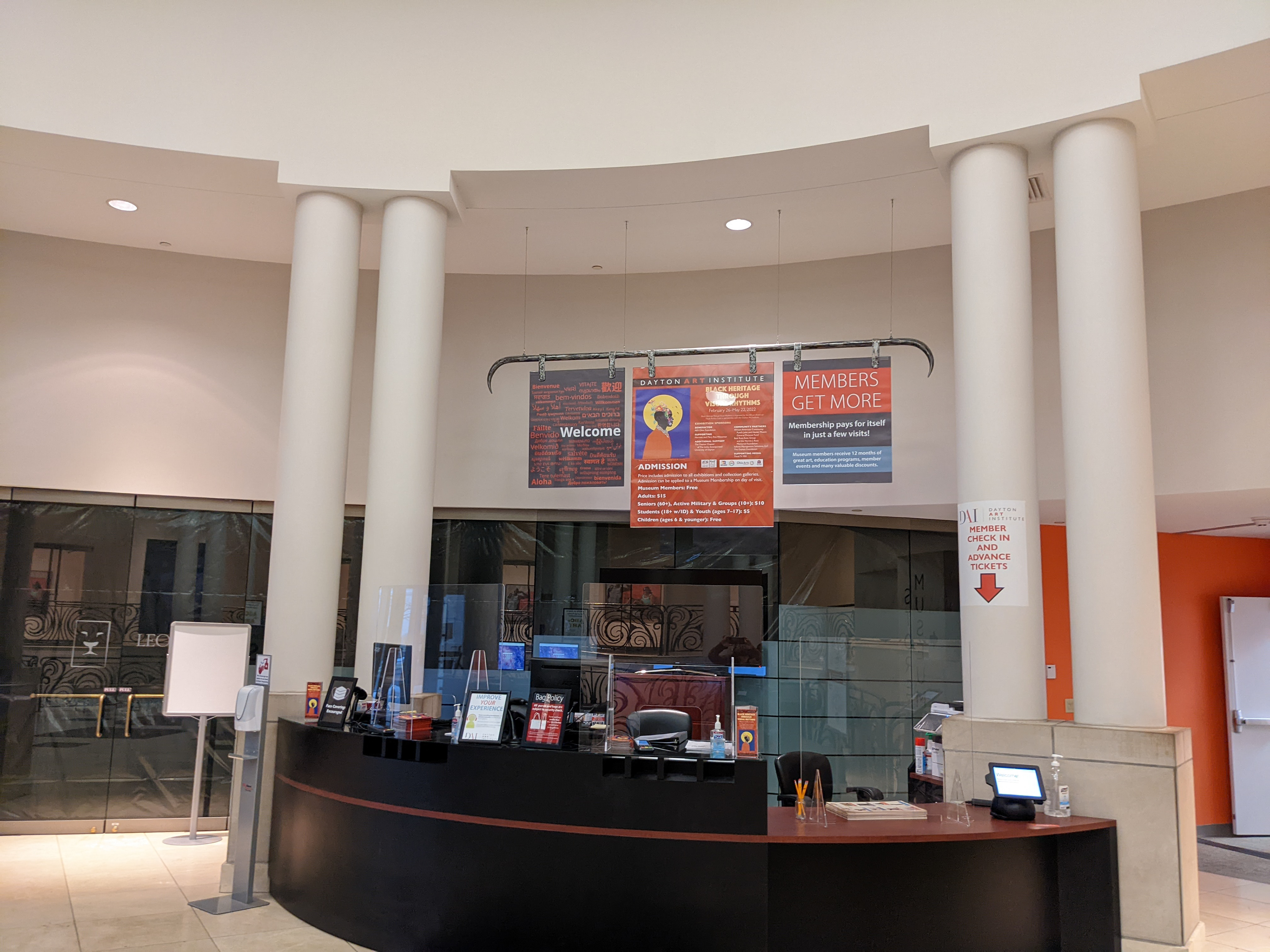
Once approved, the curatorial team used my branding to inform the color choices for the walls in the exhibition space. I created the banners, signs, donor wall vinyl and text panels for the exhibition. I also produced the rack card, invitations for the large donor and member receptions, and the print and digital ads.
For more branding and logo design examples I've done for Special Exhibitions, please visit Additional Work. For logo, branding and design work I've done for large fundraisers, please visit Large Events.
BLACK HERITAGE THROUGH VISUAL RHYTHMS DESIGN PIECES
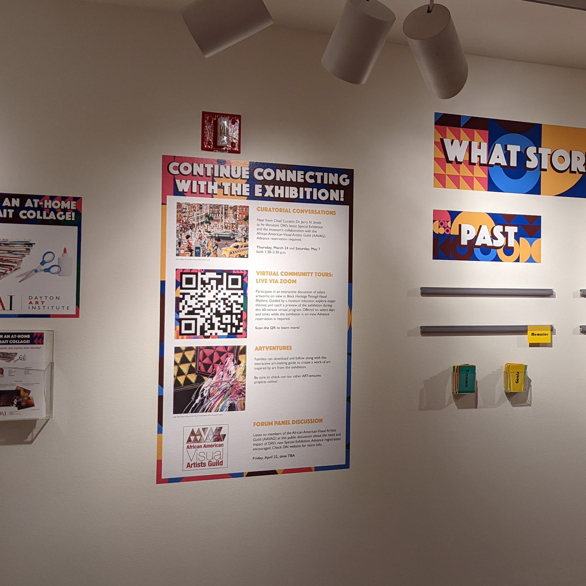
An overview of some of the materials I created for this special exhibition. Clockwise from top right: JPS (high-level donor) preview and reception invitation. Digital Rack Card, which is available to view on on the DAI website during the exhibition run. Rack card, which is distributed around the greater community and is also available for museum guests to take with them. This piece was so popular with guests that I had to reorder it several times before the exhibition closed. Interactive space at the end of the exhibition. This space is under the purview of the educational team. After meeting with the Curator of Education, it was decided that the theme of this space would relate to the exhibition but have a different look and feel. I kept the browns and golds, but added bright blues and pinks to a playful geometric pattern.
BLACK HERITAGE THROUGH VISUAL RHYTHMS PHOTO GALLERY
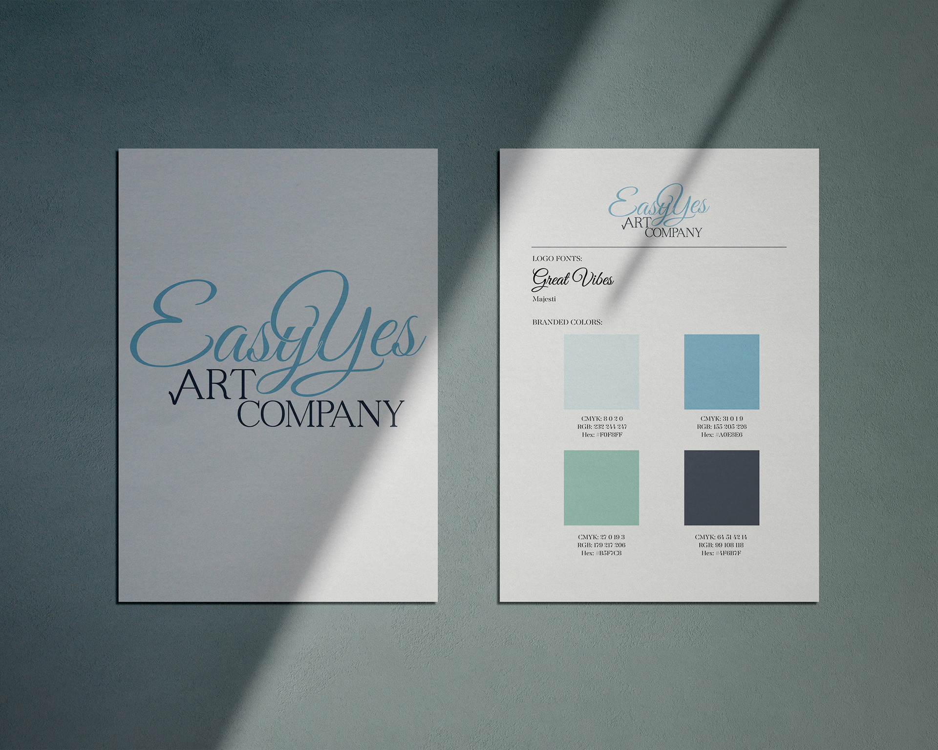
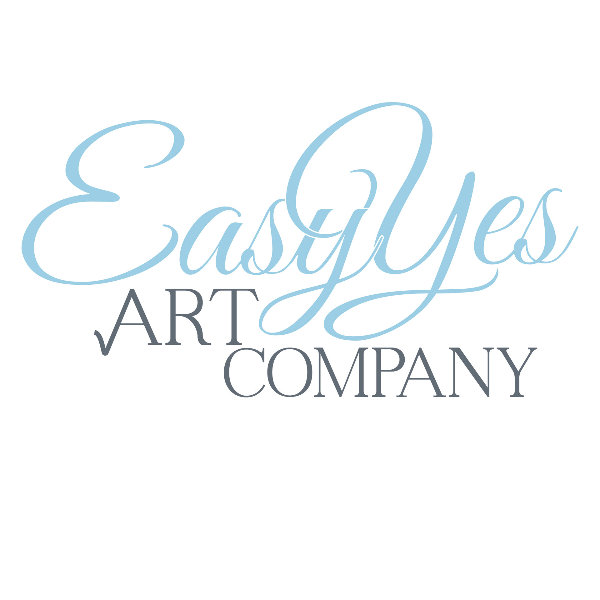
Easy Yes Art Company
LOGO DESIGN & MINI STYLE GUIDE
A Dayton-area startup, specializing in original artworks and other merchandise for sale, contacted me to create a logo and mini style guide. The owner and founder hopes to eventually curate art collections for clients, specifically hospitals.
THE PROCESS
At our first meeting, my client shared a few samples of her artwork that will be for sale. I made note of the style and approach she used in her artwork, and was able to apply that while I was concepting an appropriate logo. After the meeting, I reviewed her parameters for the design: utilize script and serif fonts, a check mark to allude to the purchase of art as an ‘Easy Yes’ for the customer, and the use soft pastels, with a preference for blues and greens.
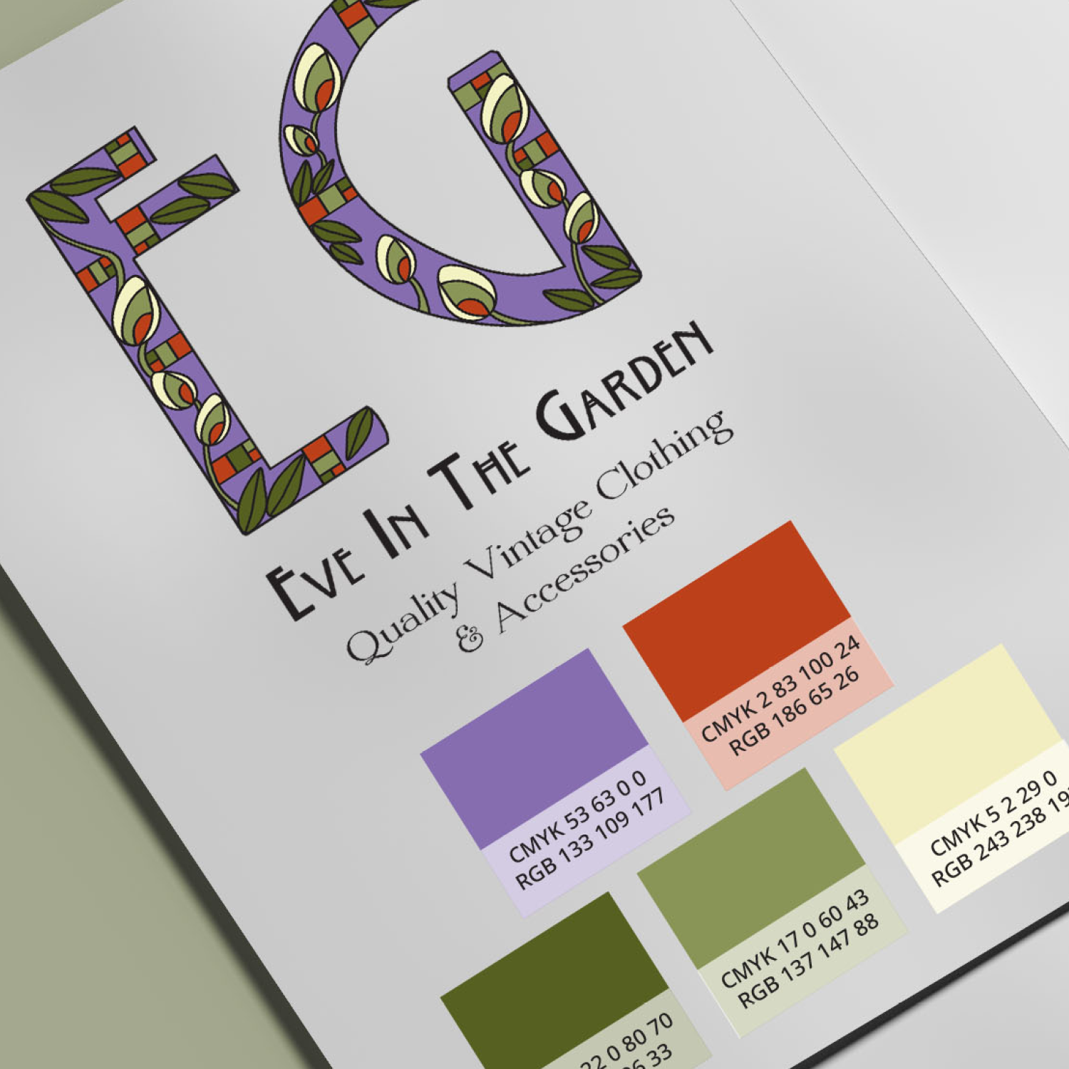
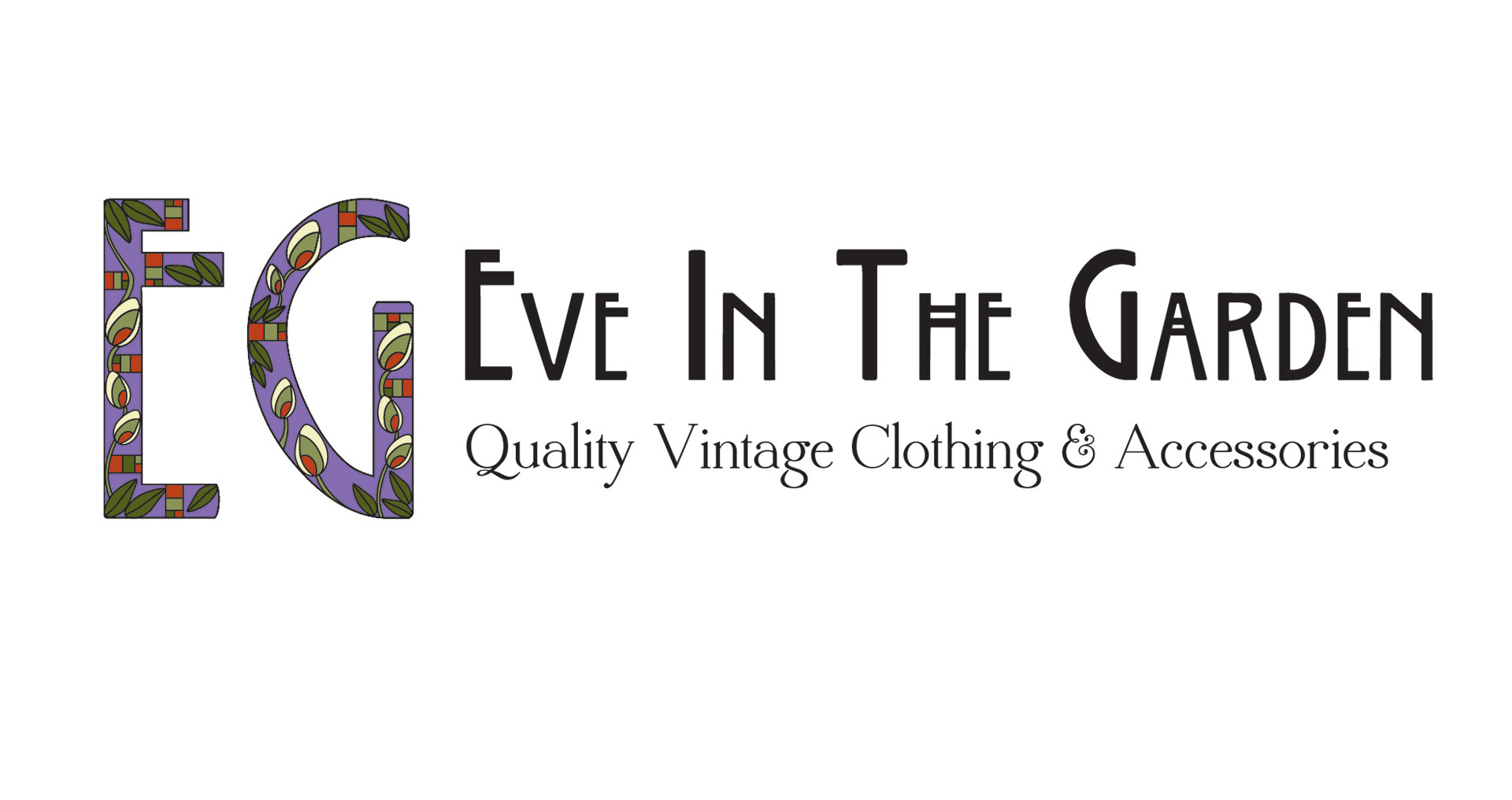
Eve in the Garden
LOGO DESIGN & MINI STYLE GUIDE
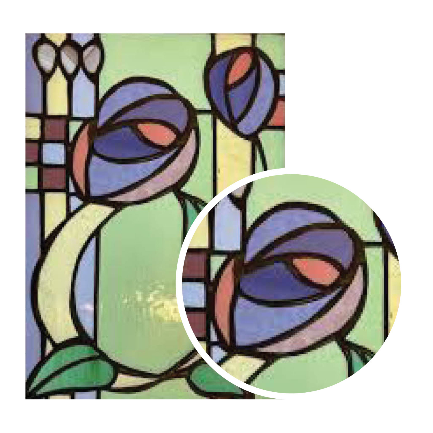
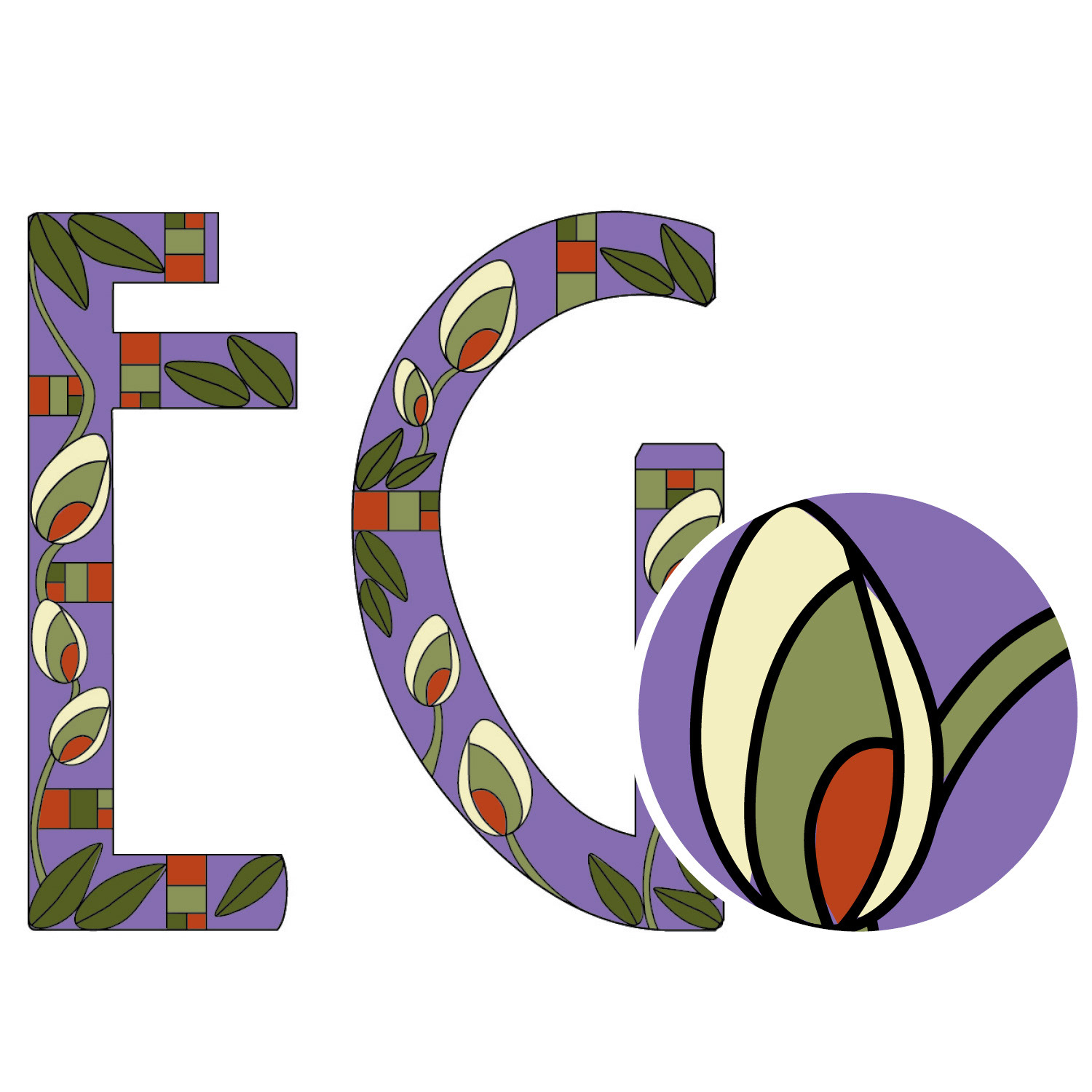
I was approached to create a logo for an online vintage shop. My client is a life-long vintage shopper, with a special affinity for Art Nouveau design and art.
THE PROCESS
The font—inspired by Charles Rennie Mackintosh’s Art Nouveau designs—was non-negotiable for the client. I chose a delicate serif font for the subheading. She provided me with images of stained glass from the period, to guide my design process. The floral motif was the perfect choice—feminine and delicate, like the merchandise she would be offering for sale.
I noticed that my client often wore green, and she mentioned that orange was her favorite color. I opted for lavender as the primary color with shades of green, a creamy yellow and a bright pop of orange as the secondary colors.
ADDITIONAL LOGO DESIGNS
Typography is a main component in my approach to logo design
Art Ball 2022 Logo
Created for the Summer 2022 Exhibition
Created for the Winter/Spring 2022 Special Exhibition
Bespoke lettering and logo created for Lange Family Experiencenter 2019
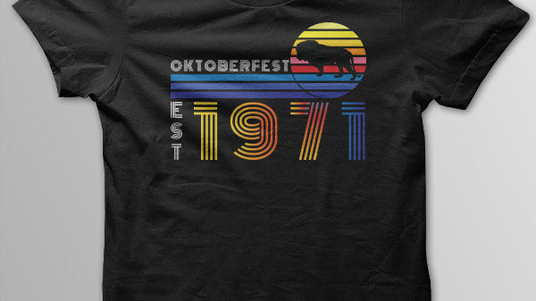
Created in collaboration for Dayton Art Institute's 2019 Oktoberfest
Developed for The Lange Family Experiencenter in 2018
Developed for The Lange Family Experiencenter 2015

Concept logo for proposed real estate app 2020
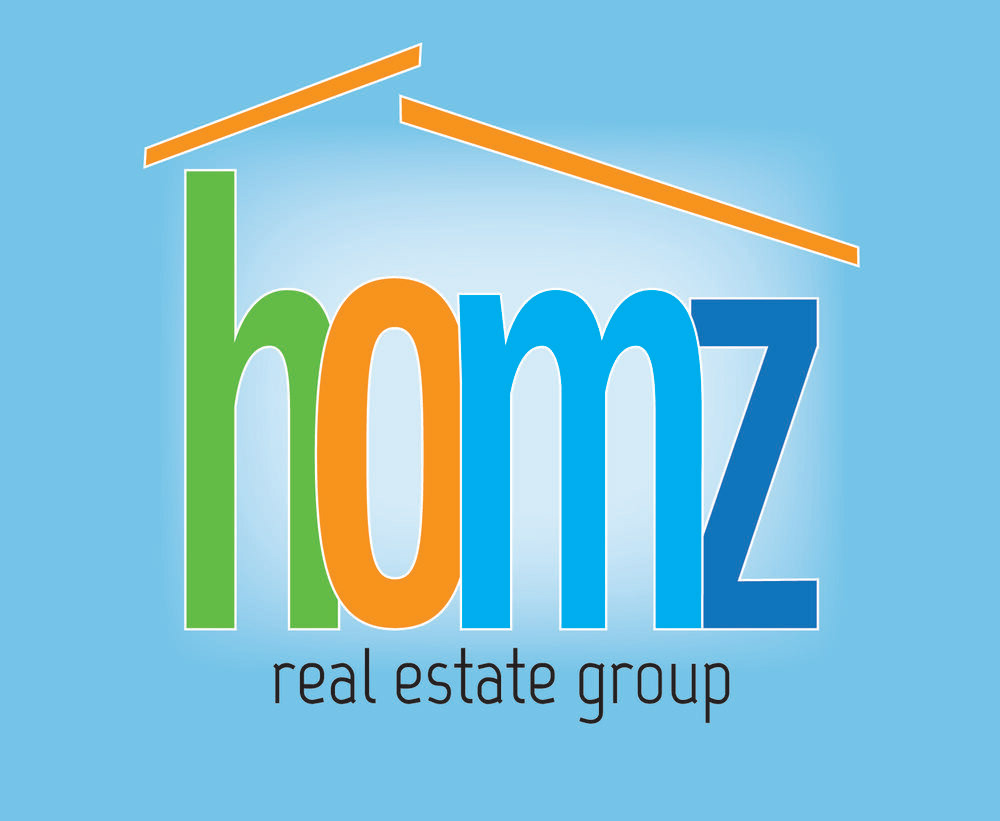
Created for HOMZ Real Estate Group 2018
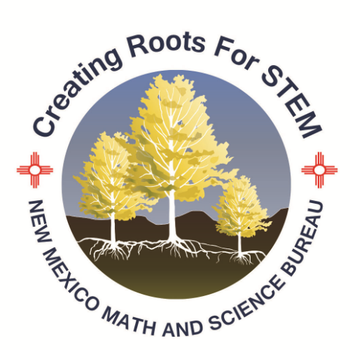
Created for the New Mexico Math and Science Bureau 2013
Bespoke Lettering created for the Lange Family Experienceneter logo